Our Work · Case Studies

Case Studies That Turn Purpose Into
Performance

We partner with nonprofits, trusts, and mission-led organizations to build digital experiences that drive clarity, trust, and measurable impact.

What We Do

We Help Mission-Led Organizations Build Websites That Inspires Action

From nonprofits rescuing animals to foundations uplifting communities, we design digital experiences that turn complex missions into clear, trustworthy, and conversion-ready platforms.

Clarity-first digital architecture

Emotion-led storytelling frameworks

Trust-driven donor journeys

Conversion-focused design systems

Mahipatsinh Foundation
Education · NGO · Compliance01

Mahipatsinh Foundation

A Name That Moves Thousands Now Backed by a System That Never Stops.

The Challenge

Mahipatsinh Chauhan a man whose story speaks for itself a lifetime spent helping thousands, building schools, and uplifting communities. People across India knew his name, Googled him, and wanted to support his mission. But here's the hard truth: in India, if an NGO collects donations without sharing proper data with the government, penalties under compliance law can shut everything down. No system meant no sustainability. Without automated receipts, recurring donation infrastructure, or data ownership, the foundation was one compliance gap away from losing everything it built.

What We Delivered

We engineered a complete digital backbone a website where donors from anywhere in the world can set up static recurring donations that auto-deduct monthly. Every single donation triggers an instant auto-generated 80G tax receipt, fully compliant with Indian government norms. The entire donor database, server access, and admin panel were placed under Mahipat Singh's direct ownership no third-party agency can access, misuse, or hold their data hostage. Govindani Infotech built a portal that doesn't just process donations it builds a digital legacy for a lifetime.

The Impact

Today, Mahipat Singh doesn't ask for donations anymore. He simply tells people his name they Google it, land on his website, and contribute. The foundation now supports over 5,000 children across multiple schools, with a system that handles compliance, recurring revenue, and donor trust on autopilot. A great name finally has a great system one that brings convenience, credibility, and lasting change.

  • Recurring donation system with automated monthly deductions
  • Auto-generated 80G tax receipts on every donation fully government-compliant
  • Complete data ownership server, panel, and donor data under the foundation's control
  • SEO-optimized presence: donors find the foundation organically via Google

5,000+ children supportedFull 80G complianceZero data dependency on third parties
Read Case Study View Project
Animal Matters To me
Animal Welfare · Nonprofit02

Animal Matters To me

Rescue. Rehabilitate. Rebuild Trust in Compassion.

The Challenge

AMTM India's mission spans rescue, rehabilitation, medical care, sterilization, adoption, and fundraising but the digital experience didn't reflect the depth or urgency of that work. First-time visitors struggled to navigate across causes, and donation intent often faded before converting.

What We Delivered

We restructured the entire website around a donation-first content architecture, layering emotional storytelling with clear service categorization. Every rescue initiative, medical program, and adoption pathway was given its own discoverable flow making the mission feel both immediate and deeply organized.

The Impact

Visitors now encounter a website that mirrors the seriousness and warmth of AMTM's mission. Donor understanding improved, emotional connection deepened, and the path from awareness to support became far more intuitive.

  • Streamlined donation-focused content architecture
  • Better visibility for rescue, rehabilitation, and adoption initiatives
  • Improved trust through clearer storytelling and program categorization
Clearer donation journeyStronger trust-buildingBetter program visibility
Read Case Study View Project
Malakhamb Artist
Sports Heritage03

Malakhamb Artist

Ancient Art. Modern Stage. One Platform to Carry It Forward.

The Challenge

Malakhamb India's ancient pole gymnastics art deserves global recognition, but its digital presence was nearly invisible. Athletes and trainers had no unified platform to showcase their craft, attract sponsorships, or collect donations. A recent ₹50,000 donation proved the demand existed, but the infrastructure to scale that support simply wasn't there.

What We Delivered

We built a purpose-driven platform that celebrates Malakhamb's heritage while functioning as a modern fundraising and awareness engine. The website features athlete profiles, event showcases, donation flows, and a compelling narrative that bridges tradition with contemporary digital storytelling.

The Impact

The platform transformed Malakhamb from a niche cultural practice into a digitally discoverable movement. Sponsorship inquiries increased, donations became streamlined, and the art form gained the professional digital identity it deserved.

  • Heritage-first design that honors the art form's cultural roots
  • Integrated donation system with transparent fund utilization
  • Athlete and event showcase for global visibility
Growing donor baseGlobal cultural visibilityStreamlined sponsorship pipeline
Read Case Study View Project
Gau Seva Dham
Veterinary Care · Animal Shelter04

Gau Seva Dham

Hospital-Grade Compassion. Zero-Cost Care.

The Challenge

Gau Seva Dham operates a super-specialty gau hospital with free veterinary care, shelter, and rehabilitation a scale that demands authority. The existing digital presence didn't fully communicate the depth of infrastructure, medical expertise, or the trust required to attract donors.

What We Delivered

We repositioned the organization's digital identity to reflect its hospital-grade operations. Service hierarchy, medical credibility framing, team visibility, and donation storytelling were rebuilt to match the seriousness of the mission.

The Impact

The website now conveys scale, legitimacy, and urgency in equal measure.Visitors immediately understand the seriousness of the operation increasing trust, support intent, and willingness to contribute.

  • Stronger presentation of hospital-grade care and free veterinary services
  • Improved trust through better service hierarchy and credibility framing
  • Better visibility for rescue, shelter, treatment, and donation campaigns
Stronger trust-buildingBetter service discoverabilityMore authoritative positioning
Read Case Study View Project
Popatbhai Charitable Foundation
Multi-Cause Philanthropy · Social Impact05

Popatbhai Charitable Foundation

Many Causes. One Foundation. One Seamless Experience.

The Challenge

The foundation supports shelter, ration kits, women empowerment, orphan care, divyang support, medical aid, and animal welfare all under one umbrella. Without structured digital architecture, this breadth risked feeling scattered and unfocused.

What We Delivered

We designed a cause-based website flow that organizes every initiative into an intuitive, emotionally compelling journey. Campaign visibility was amplified, the donation structure was rebuilt for clarity, and each cause was given its own identity within a unified brand framework.

The Impact

Users now navigate multiple programs effortlessly, trust the foundation more quickly, and take action with less friction. The website reflects the foundation's breadth as a strength not a complexity.

  • Simplified navigation across multiple charitable causes
  • Better structure for donations and cause discovery
  • Stronger emotional connection through organized storytelling
Improved cause discoverabilityClearer donation pathwaysBetter mission alignment
Read Case Study View Project
Harsh Chhikara Jan Sewa Trust
Community Welfare · Nonprofit06

Harsh Chhikara Jan Sewa Trust

Years of Field Work, Finally Somewhere It Accumulates.

The Challenge

The trust does visible, photographable work on the ground every week feeding drives, medical camps, direct family support. But all of it lived on social media, where a post disappears from view within days of publishing. Media coverage and honours had nowhere permanent to sit. A donor evaluating the trust had no way to see the accumulated weight of years of work, only whatever happened to be the most recent post.

What We Delivered

We built a permanent public archive: galleries, media mentions and honours each given their own linkable home so every new piece of coverage compounds instead of scrolling away. Beneficiary stories were given a repeatable structure situation, intervention, outcome so the team can publish a new one quickly and it carries the same weight as the last. Helpline, email and partnership enquiries were separated so an urgent case and a CSR conversation don't land in the same undifferentiated inbox.

The Impact

The trust's work now accumulates instead of dissolving. Coverage and honours are linkable, which means they can be cited directly in grant applications and CSR conversations rather than described from memory. Urgent cases reach the helpline without competing with partnership enquiries.

  • Permanent gallery and media archive replacing disposable social posts
  • Repeatable beneficiary story template for fast publishing
  • Honours and recognition given a citable home
  • Separate routing for helpline, email and partnership enquiries
Work accumulates publiclyCoverage citable in grant applicationsUrgent and partnership paths separated
Read Case Study View Project
Nanhi Pari Foundation
Child Welfare · Nonprofit · Transparency07

Nanhi Pari Foundation

Built to Survive the Scrutiny Serious Donors Apply.

The Challenge

Institutional donors and CSR partners evaluate governance before they evaluate a cause. They want to see how an organisation is run, who runs it, and what it publishes about itself and they want to find that in under a minute, without asking. Nanhi Pari had the substance but not the structure: transparency was a commitment rather than a section, and a Mumbai helpline needed prominence for urgent cases without swamping the donor journey.

What We Delivered

Transparency was built as a dedicated, linkable section rather than a claim in a paragraph so it can be sent directly into a CSR due-diligence process. An At a Glance summary lets an evaluator establish scale and scope in one screen before deciding whether to read further. Team and governance pages give names and roles. The helpline sits prominently and separately from the donation flow, so the two urgencies never interrupt each other.

The Impact

Governance information can now be cited in due diligence instead of assembled on request. Evaluators can establish the foundation's scale in a single screen. Families needing urgent help and donors making a considered decision each get a path that suits them.

  • Dedicated transparency section built for CSR due diligence
  • At a Glance summary for fast institutional evaluation
  • Named team and governance pages
  • Helpline prominence without disrupting the donor journey
Due-diligence readyScale legible in one screenTwo urgencies, two paths
Read Case Study View Project
CI Builders
Real Estate · Lead Generation08

CI Builders

Two Decades of Delivery, Presented the Way Buyers Actually Shop.

The Challenge

CI Group has built residential and commercial property across Madhya Pradesh for twenty years. But property buyers research online for weeks before they ever walk into a site office, and during that research phase CI was being judged against competitors on a presence that badly understated its track record. Ongoing projects sat in a shared list rather than getting individual treatment, and enquiries arrived without project or budget context so the sales team spent its first call qualifying rather than selling.

What We Delivered

Each ongoing project CI Grand, The Park at CI Estate was given its own page with configuration, location, amenities and gallery, because a buyer is shopping for one specific property, not browsing a developer. Twenty years of completed delivery was made prominent, since fear of non-completion is the single largest anxiety in this market and track record is the strongest answer to it. Enquiry forms capture project and configuration interest so the sales team knows what a lead wants before dialling.

The Impact

Each project can now be marketed and linked independently in campaigns rather than pointing everything at one homepage. Enquiries arrive with project and configuration context attached, so the first sales conversation starts further along.

  • Individual project pages for CI Grand and The Park at CI Estate
  • Twenty-year delivery record made prominent
  • Configuration and amenity detail published openly
  • Qualified enquiry capture routed to sales
  • Local SEO structure for Bhopal property search
20 years of deliveryPer-project campaign targetingQualified enquiries
Read Case Study View Project
Janki Builders
Real Estate · Premium Positioning09

Janki Builders

What's Selling Now, and What Proves You Deliver Are Not the Same Page.

The Challenge

Janki Group markets premium residential property in Bhopal across both current and completed developments. The structural problem was that ongoing and past projects do completely different jobs in a buyer's decision one has to sell, the other has to prove capability and merging them into a single portfolio served neither. Premium positioning also has to be visible in the presentation itself, because buyers discount adjectives and read design.

What We Delivered

Two tracks with two purposes. Ongoing projects Abhyudayam, Janki Residency are structured to convert, with configuration, amenities and enquiry capture. Past projects like H. K. Homes and Janki Apartments are structured as evidence of delivery. Premium was communicated through spacing, typography and photography treatment rather than claimed in copy. Amenities and location detail were published openly rather than gated, on the reasoning that an informed enquiry is worth more than a larger number of uninformed ones.

The Impact

Current inventory and delivery record each do their own job instead of diluting each other. Buyers can self-qualify on amenities and location before enquiring, so the enquiries that do arrive are further along.

  • Ongoing and completed projects separated by purpose
  • Individual pages for Abhyudayam and Janki Residency
  • Premium positioning expressed through design, not adjectives
  • Amenity and location detail published rather than gated
Sell and prove, separatedBuyers self-qualify pre-enquiryPremium read from presentation
Read Case Study View Project
Mahaveer Eye Hospital
Healthcare · Specialist Clinic10

Mahaveer Eye Hospital

Built Around How Anxious Patients Actually Choose Eye Surgery.

The Challenge

Patients choosing eye surgery are frightened. They research for weeks, read every testimonial, and are persuaded almost entirely by surgeon credentials and the experience of people like them. Mahaveer Eye Hospital had the credentials, the awards and the patient stories but they were organised the way the hospital thinks about itself, not the way a patient searches. A person researching LASIK had to assemble reassurance from three separate pages.

What We Delivered

Content was reorganised by the procedure a patient is actually researching, because that is the term they search and the question they hold. Surgeon qualifications and hospital recognition were moved to the exact point in each page where a patient decides whether to trust the procedure, instead of being collected on a separate About page nobody reaches. Patient accounts were placed adjacent to the procedures they describe, so reassurance arrives in context rather than as a generic carousel.

The Impact

A patient researching a specific procedure lands on content matched to it, with the surgeon's credentials and another patient's experience in the same view as their hesitation. Appointment enquiries arrive from people who have already resolved their main doubts.

  • Content organised by procedure, matching how patients search
  • Surgeon credentials placed at the point of hesitation
  • Awards and recognition surfaced rather than filed away
  • Patient testimony placed beside the relevant procedure
  • Appointment enquiry routing
Procedure-led structureCredentials where doubt arisesTestimony in context
Read Case Study View Project
Baba Ji Ki Buti
E-Commerce · Custom Build · Wellness11

Baba Ji Ki Buti

The Product Story Sells the Product. Templates Bury It.

The Challenge

Traditional wellness products are bought on trust in provenance and preparation, not on a photograph and a price. Every template storefront on the market imposes the same layout, and that layout pushes the story below the buy button where nobody reads it. A buyer deciding whether a traditional remedy is credible needs that reasoning at the moment of decision, not three scrolls down.

What We Delivered

We coded the storefront directly rather than adapting a theme, which removed the layout constraints that make every template store read the same. Product provenance and preparation sit beside the purchase decision instead of beneath it. Checkout states payment and delivery expectations plainly, because abandonment in this category is driven by doubt rather than price.

The Impact

Product narrative and purchase decision now occupy the same screen. The store is not constrained by template layout rules, so future catalogue and brand changes are edits rather than migrations.

  • Custom-coded storefront, not a template adaptation
  • Provenance and preparation placed beside the buy decision
  • Integrated payment gateway
  • Checkout built to answer doubt, not just take payment
Story beside the buyNo template constraintsDoubt addressed at checkout
Read Case Study View Project
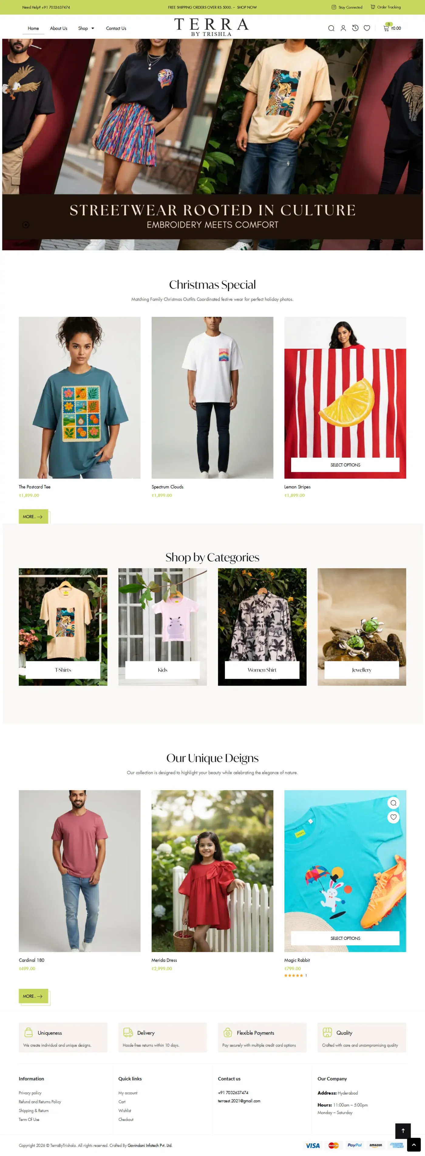
Terra by Trishla
E-Commerce · Creator Brand12

Terra by Trishla

Creator Commerce Dies When the Store Strips Out the Voice.

The Challenge

Terra by Trishla describes itself as "pop, drama and everything extra" and that voice is precisely why its audience buys. Creator commerce fails in a predictable way: the brand gets a clean, conversion-optimised, entirely neutral storefront, and the connection that built the audience is severed at the exact moment of purchase. Almost all traffic arrives from a social link, on a phone, mid-scroll.

What We Delivered

The brand's tone was treated as a functional requirement rather than decoration a store reading neutral would lose the thing that makes the audience buy. The first screen assumes arrival from social on mobile, with product and personality both present immediately. Conventional commerce mechanics were applied underneath the brand expression rather than replacing it.

The Impact

The store reads as the creator's own space rather than a generic shop. Social arrivals meet product and personality on the first screen instead of landing somewhere that feels like a different brand.

  • Brand voice treated as a build requirement
  • Social-first mobile landing experience
  • Commerce mechanics beneath brand expression, not replacing it
  • Payment integration
Voice preserved through checkoutBuilt for social arrivalMobile-first
Read Case Study View Project
Madhav Numerology
E-Commerce · Service Productisation13

Madhav Numerology

A Consultation Business Capped by the Practitioner's Calendar.

The Challenge

Numerology and tarot consultation almost always sells through direct messages and phone calls, which caps revenue at exactly one thing: how many conversations the practitioner can personally have. It also asks a client to pay for something intangible before understanding what they will actually receive. Credibility carries the entire purchase decision, and credibility was buried.

What We Delivered

The five-year prediction report was defined as a concrete deliverable with stated scope, so it can be bought like a product rather than negotiated like a service. The practitioner's background leads the page rather than following the offer, because in this category credibility is the product. A full shop and checkout flow means a client can purchase and receive without a preliminary call, while a separate enquiry route stays open for bespoke requests.

The Impact

Consultations can now be purchased without a preceding conversation, which uncouples revenue from calendar availability. The report has defined scope a buyer can evaluate before paying.

  • Five-year report productised with stated scope
  • Practitioner credibility leads the page
  • Full shop and checkout for services
  • Separate route preserved for bespoke requests
Revenue uncoupled from calendarIntangible made evaluableBuy without a call
Read Case Study View Project
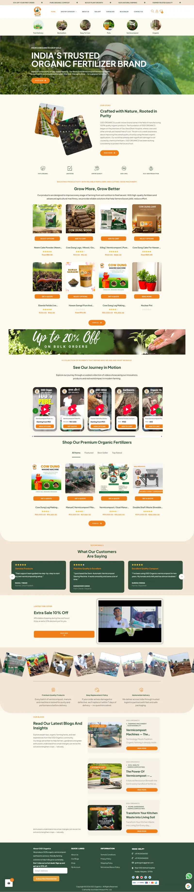
GSD Organics
E-Commerce · Agriculture14

GSD Organics

Farmers Buy on Evidence. Marketing Language Loses Them.

The Challenge

GSD Organics sells organic compost and farming inputs to farmers among the most evidence-driven buyers in any category. Yield claims get tested against direct experience within one season, and a store that oversells loses credibility permanently. Organic input claims invite scepticism by default, and a first-time buyer has no reason to risk an unfamiliar product at scale.

What We Delivered

Product claims were kept concrete what it is, what it does, how it is applied because this audience punishes vagueness rather than rewarding enthusiasm. Positioning leans on farming credibility rather than consumer-wellness language, matching how the buyer sees themselves. A first-order incentive lowers the risk of trying an unfamiliar input, which is the actual obstacle in this category rather than price.

The Impact

Product information is now specific enough to satisfy an evidence-driven buyer, and the trial mechanic gives a sceptical first-time customer a low-risk way in.

  • Specific composition and usage detail over marketing claims
  • Farming-credibility positioning, not consumer wellness
  • First-order trial mechanic
  • Payment and delivery integration
Specific over superlativeTrial barrier loweredFarmer-framed positioning
Read Case Study View Project
MuktaShop
E-Commerce · Shopify · Jewellery15

MuktaShop

In Jewellery, the Photograph Is the Product.

The Challenge

Jewellery and accessories sell on visual detail that a small product thumbnail destroys and returns in this category are expensive, driven almost entirely by a gap between what the buyer pictured and what arrived. Shopify's default presentation flattens the difference between pieces into a uniform grid, which is precisely wrong when each piece needs to be distinguished.

What We Delivered

Layout was built around image scale and detail rather than fitting photographs into a template grid. Dimensions, materials and finish are stated explicitly on every piece to close the expectation gap that causes returns. Shopify handles the commerce reliably underneath, but the presentation layer was customised so the store does not read as a default theme.

The Impact

Product photography is presented at a scale that actually shows craftsmanship, and specifications are explicit enough that buyers know what will arrive.

  • Photography-led product pages, not a template grid
  • Explicit dimensions, materials and finish per piece
  • Shopify commerce with customised presentation
  • Payment and shipping configuration
Photography at full scaleExpectation gap closedNot a default theme
Read Case Study View Project

Our Process

From Mission to Momentum

A proven five-step framework that transforms organizational purpose into high-performing digital experiences.

01

Discovery

We study your mission, audience, and goals to build a strategic foundation for every design decision.

02

Structure

Content architecture, user flows, and information hierarchy organized for clarity and conversion.

03

Design

Visual storytelling that balances emotion with authority. Every element earns its place.

04

Build

Clean, responsive, performant code built to scale and designed to last.

05

Optimization

Performance tuning, SEO foundations, and conversion refinements to maximize long-term impact.

Why It Works

Websites built for missions that matter.

Nonprofits and foundations face a unique challenge: communicating urgency, compassion, and credibility all at once. Our approach ensures every digital touchpoint serves that purpose.

Clarity Over Complexity

We distill multi-faceted missions into intuitive digital structures that visitors understand in second not minutes.

Trust by Design

From credibility framing to donor journey optimization, every design decision is engineered to build confidence.

Emotion Meets Architecture

Storytelling without structure is noise. We balance emotional impact with rigorous information architecture.

Conversion Without Compromise

Our CTAs feel natural, not aggressive. Support pathways are woven into the experience not bolted on.

Let's Build Yours

If your mission deserves to be understood, your website should do more than just exist.

Whether you're a nonprofit, trust, or foundation we'll help you build a digital presence that earns trust, drives donations, and amplifies your impact.